Spotify
Project Overview
Designed a feature within Spotify’s existing interface to improve the music sharing experience by identifying barriers that hinder users from sharing music. Enhancing the sharing process will make it more enjoyable and effortless, making them more likely to choose it over competitors.
Tools
Figma
Miro
Airtable + Excel
Notion
My role
UX Researcher
UX Designer
Diving into the market from competitive analysis
Spotify is perhaps the most dominant music streaming platform on the market. It competes with other heavy hitters such as Tidal, Apple Music, and Pandora. Competetive analysis allows us to identify what works and what doesn't to find an edge. Studying competing apps helps build a strategy to ehnace the user experience while increasing business value.
Apple Music stands out by providing an ad-free 3-month trial. Tidal offers high-definition music videos for those seeking a full sensory experience. Pandora allows users to create multiple stations, providing variety without the need to constantly search for new artists. The interfaces of these platforms are all minimal, simple, and easy to use, with similar design patterns.
Discovering insights through qualitative research
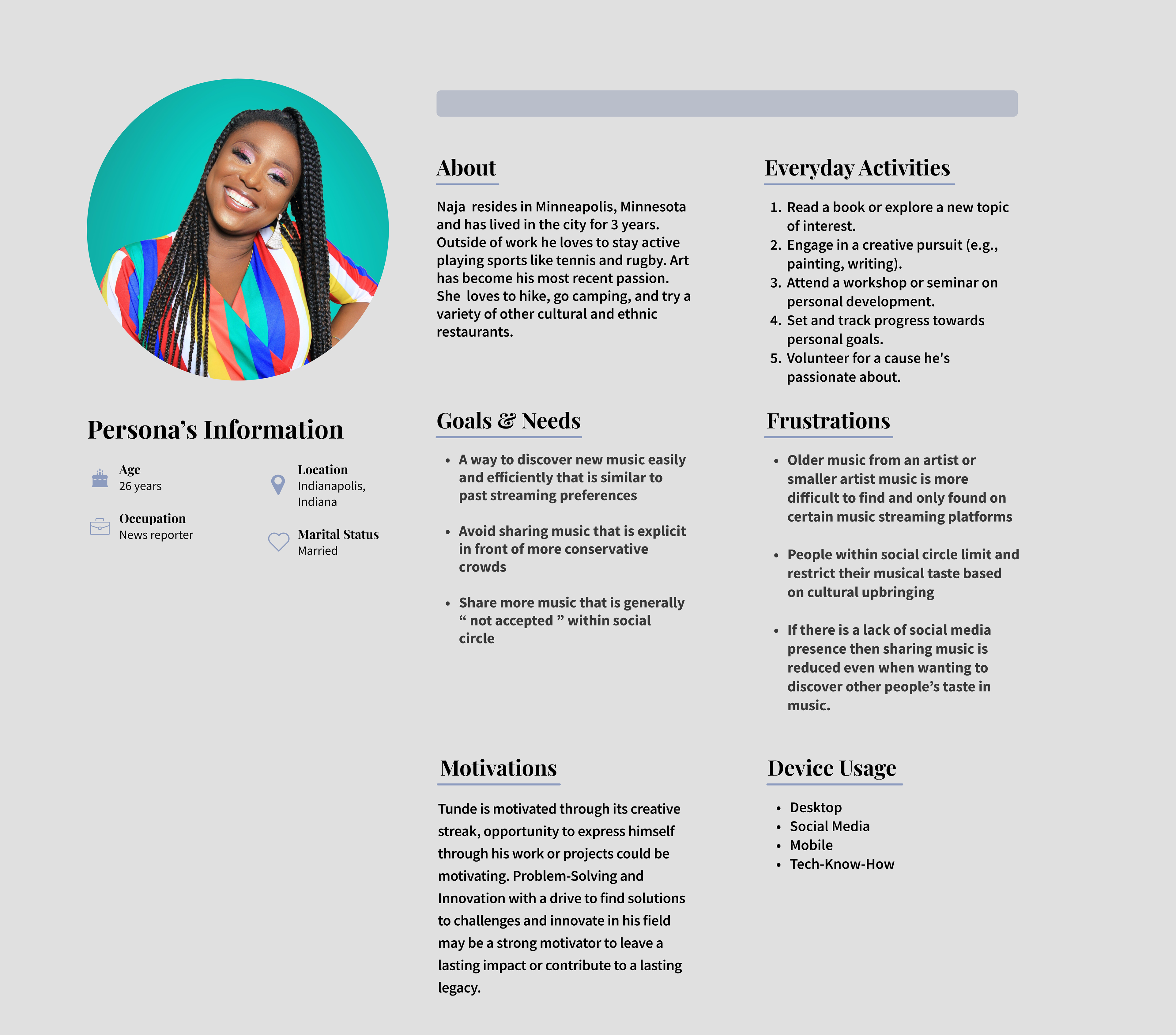
I conducted interviews for a week and a half with a total of eight participants from diverse backgrounds, ethnicities, ages, and occupations. During these interviews, I explored how users shared music and what sharing meant to them, leading to many amazing findings. To best structure these insights, I applied the Rose, Bud, and Thorn technique, which reflects these insights into the positive, the negative, and the opportunities.
Understanding the needs and frustrations of the target audience
A brief summary of findings
Interviewing the participants, collecting the data, and turning the data into insights and findings took roughly two weeks. The main focus was on the concept of sharing music. The definition of sharing music was broad, encompassing not only directly sharing music with someone, but also sharing music in a broader sense, such as playing music in the car with friends or a shop owner playing music for its patrons. To narrow down the problem, I engaged in casual conversations and asked more questions. I discovered that the motives behind why participants share music or decide not to share music were all different and fascinating.
1. When people socialize less and are less active on social media, they tend to share music less as well. This means that music lovers in this category must rely more on word-of-mouth to discover new music compared to those who don't. Additionally, those with a smaller social media presence or who engage in less activity on social media may find it more difficult to discover new genres and artists.
2. People often want to share music as a means of expressing themselves or altering their mood, as well as the mood of others. Sharing music helps people better relate to others. Certain genres and tempos can best match their mood and what they are going through, whether privately or publicly.
Reflecting on the strengths and weaknesses of insights
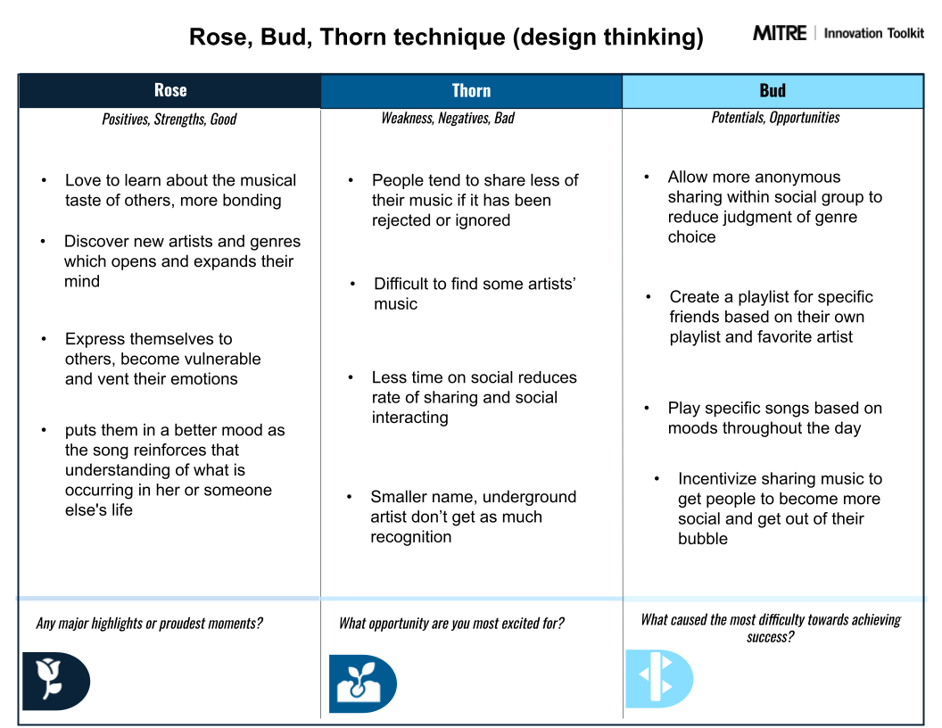
Rose, Bud, Thorn technique
Generating creative solutions to solve the right problem
The problem statement had a significant impact on identifying the issues that the participants were experiencing. Some participants shared more music than others, and there had to be a reason for this disparity. One discovery was that people share less music when they socialize less and aren't very active on social media.
The most common problem was that music lovers restricted the music they shared with their social group. This was due to past experiences of their music taste being ignored or not accepted. As a result, they tend to only share the music that aligns with the majority of their friends' tastes and withhold the minority of their music preferences. Negative feedback in the past has led them to believe that their social group is not open to new genres and artists, causing them to refrain from expressing their own opinions about music.

Sketching weird, impossible, and impractical ideas
After identifying the issues outlined in the problem statement, it was time to brainstorm 24 ideas in 24 minutes. I used the fast-paced, chaotic yet practical crazy-eight technique to come up with a solution. Each sketch aimed to explore all the different possibilities that could lead to the final design. Some ideas were absurd and irrational, but others were the beginning of something substantial.
The low-fidelity iterations focused on encouraging users to step out of their comfort zone, socialize more, and embrace music genres that they were not accustomed to. Instead of immediately jumping to solutions, I wanted to keep the possibilities open.
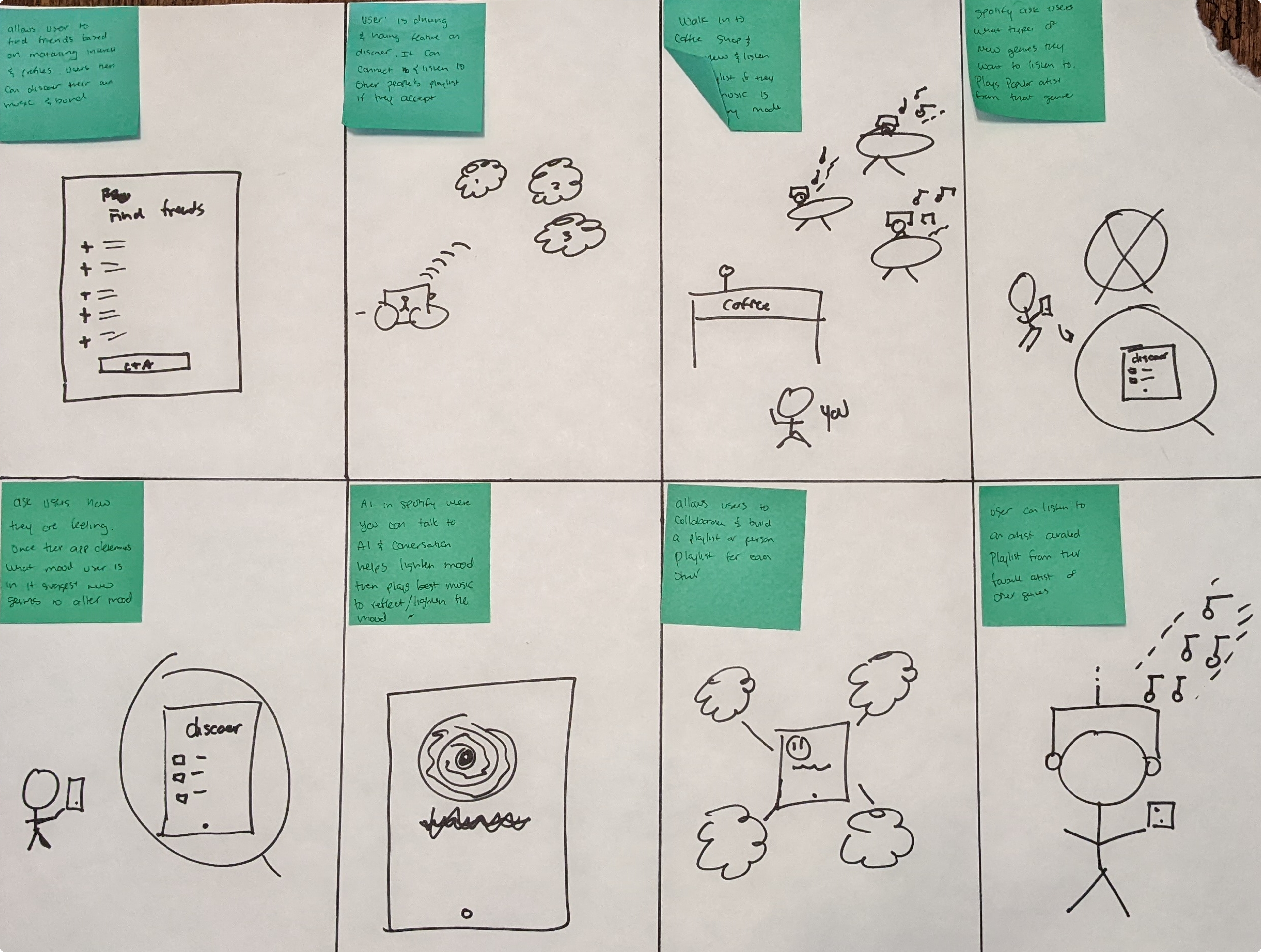
Brainstorming solutions to design challenges
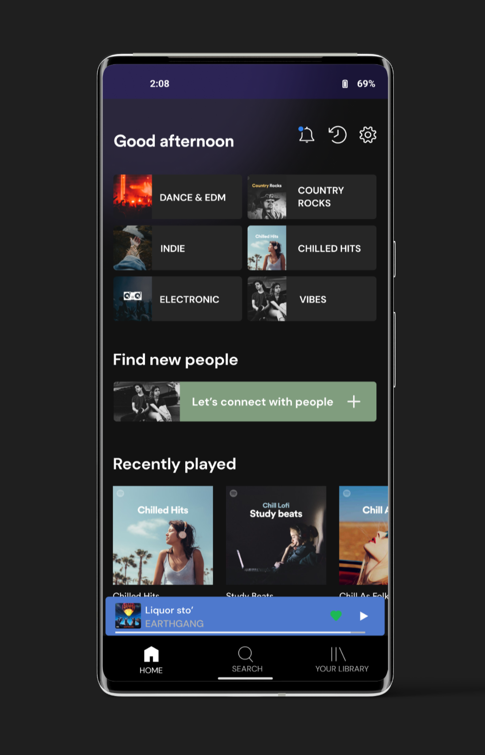
I used a combination of the storyboard and crazy-eight techniques in a fast-paced, timed environment. It was challenging, but it ultimately led to a great discovery. After hours of brainstorming, my goal was to encourage socialization and push people out of their comfort zones to discover new music. These two objectives culminated in the form of the CONNECT feature. During the research phase, I found that none of the competing music streaming platforms had integrated a feature focused on meeting new people. While all the brands only offered a share option that connected users to social media platforms, there was no emphasis on connecting with new individuals through the music platform itself.
What is the Connect feature?
CONNECT is a great way to build new relationships by exploring different types of music. You can not only meet people with similar interests but different music tastes too, and make friends while discovering new artists and genres. Your profile matches will be able to see your playlist, favorite song, and bio, so they can get to know a little about you.
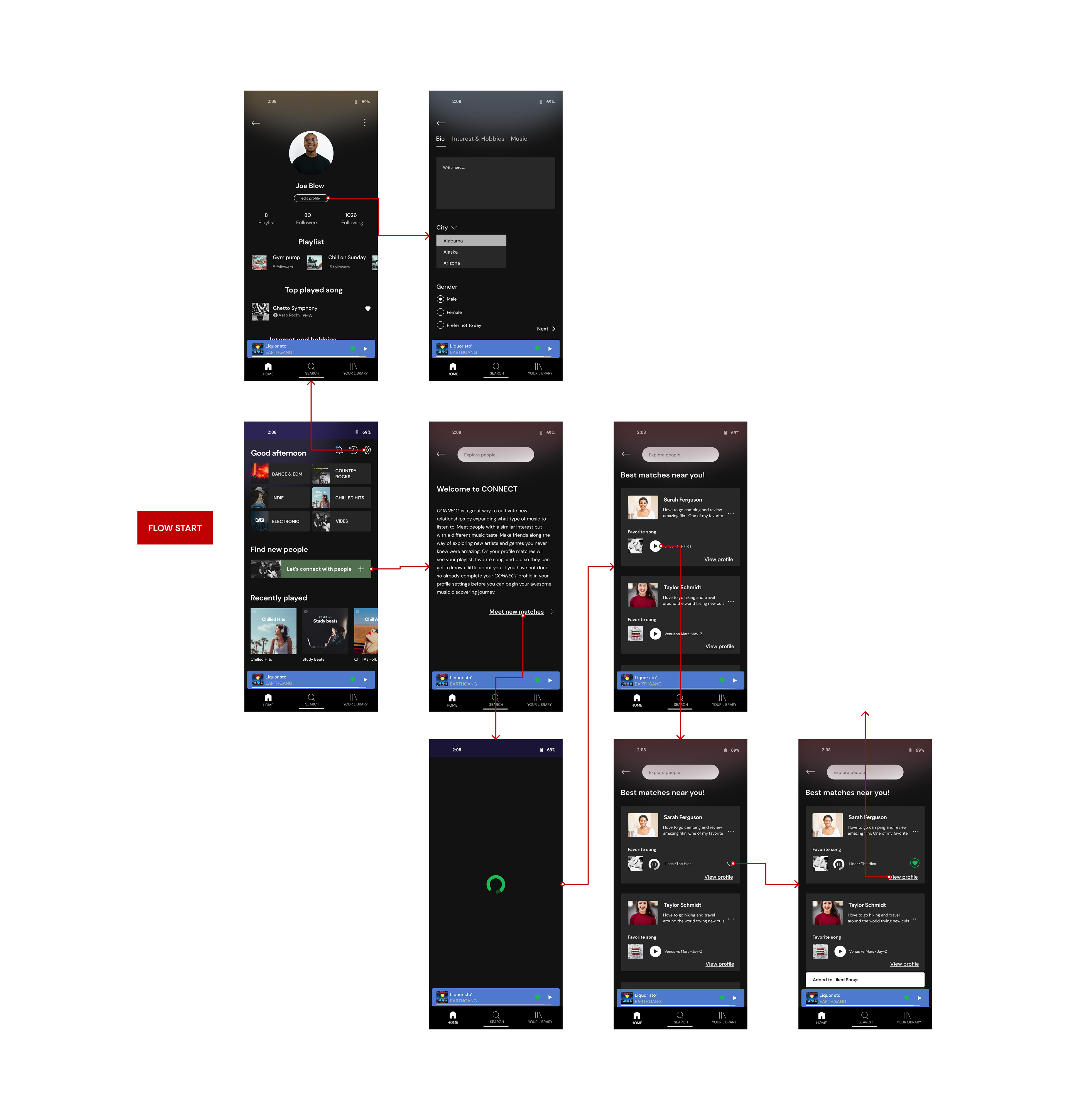
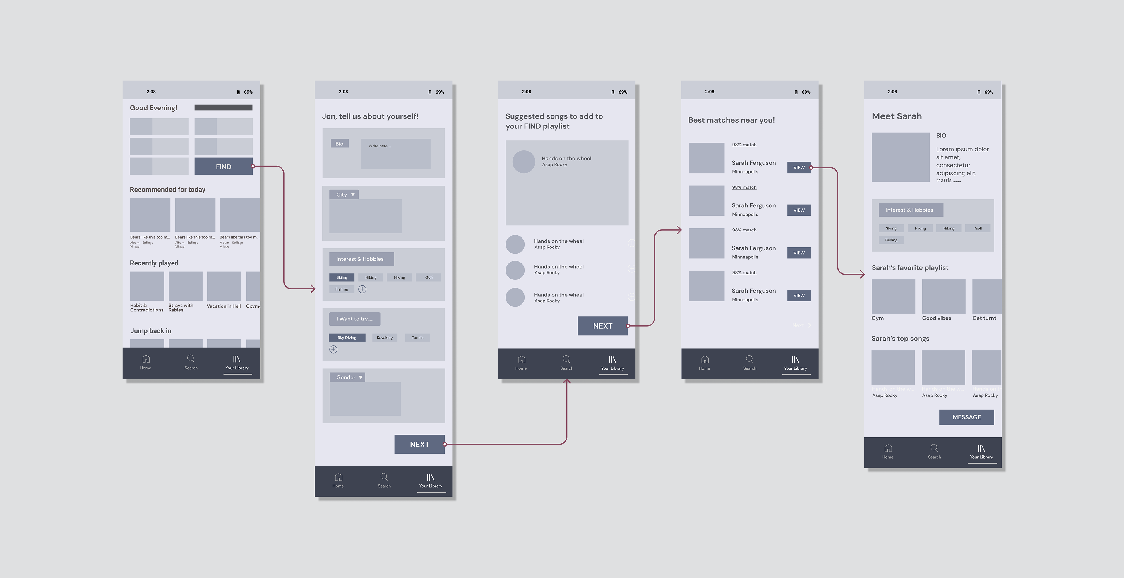
Mapping the user's task with wireframes
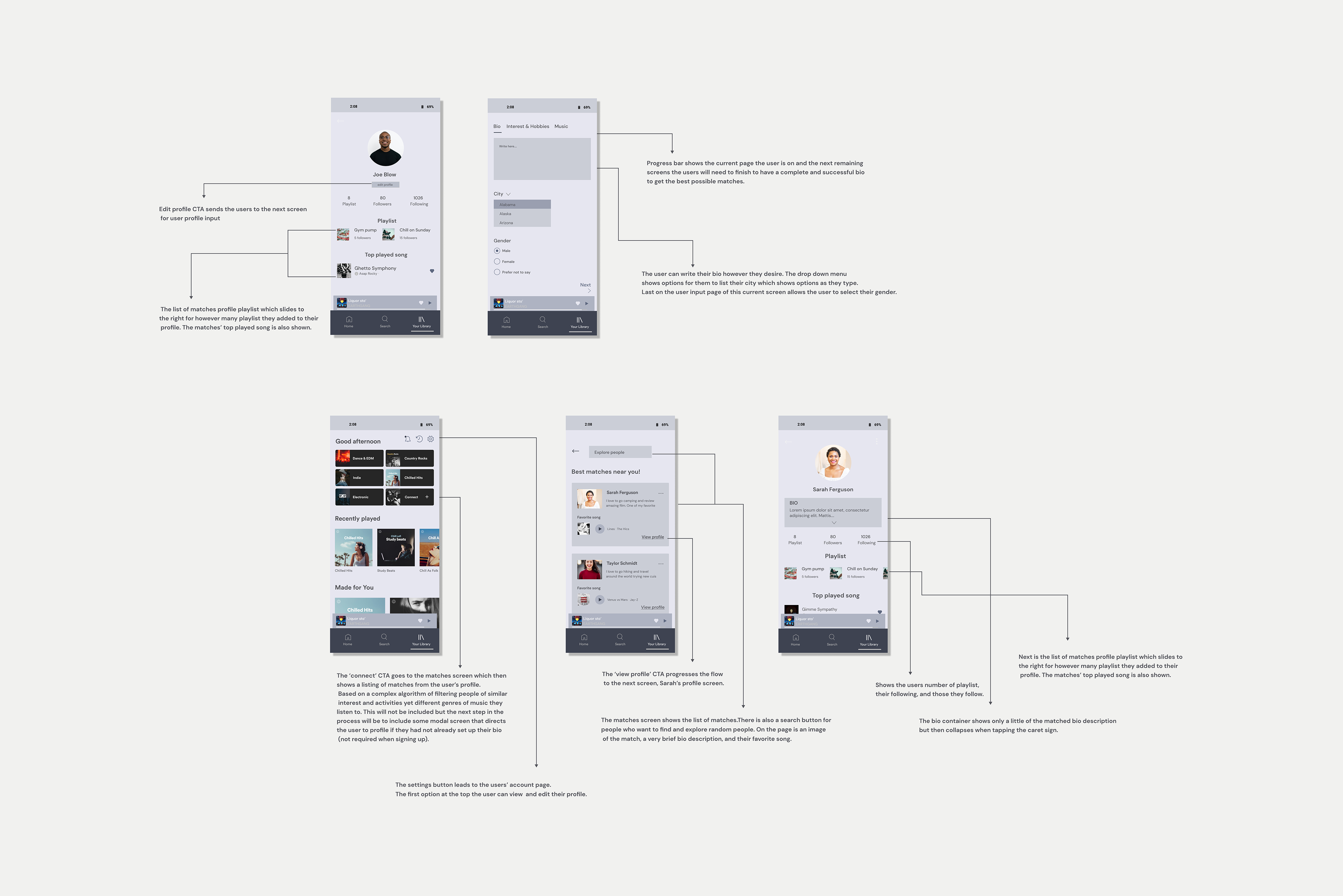
I focused on creating wireframes with high fidelity while reducing visual clutter to ease the transition to the final UI. However, the initial wireframes lacked context, confusing the next steps. After multiple iterations, I developed a wireframe that prioritize visual clarity, making it easier for users to understand the importance of each element on the screen. The first option allows users to edit their profile to access the CONNECT profile, which is necessary for obtaining information on the best matches. The second step assumes the profile is up to date, and users can then click the "CONNECT" call-to-action. Below are steps correlating to each wireframe.
1. If not up to date, the next screen shows the user's profile
2. Following that the user has the option to edit their profile which takes them to a three-step process to complete their CONNECT profile
3. The next screen is a list of the user's matches
4. When the users click Sarah's profile it takes them to Sarah's profile page
Usability assumptions of the testing the interface
1. Users will want to see the percentage strength of the match to understand how compatible they will be.
2. The interests and hobbies of the matched profile should be as or more prominent than the profile's music.
3. In the flow potential, Spotify Connect feature, users will want to curate a special list and showcase it to their matches.
UI & interactive screens
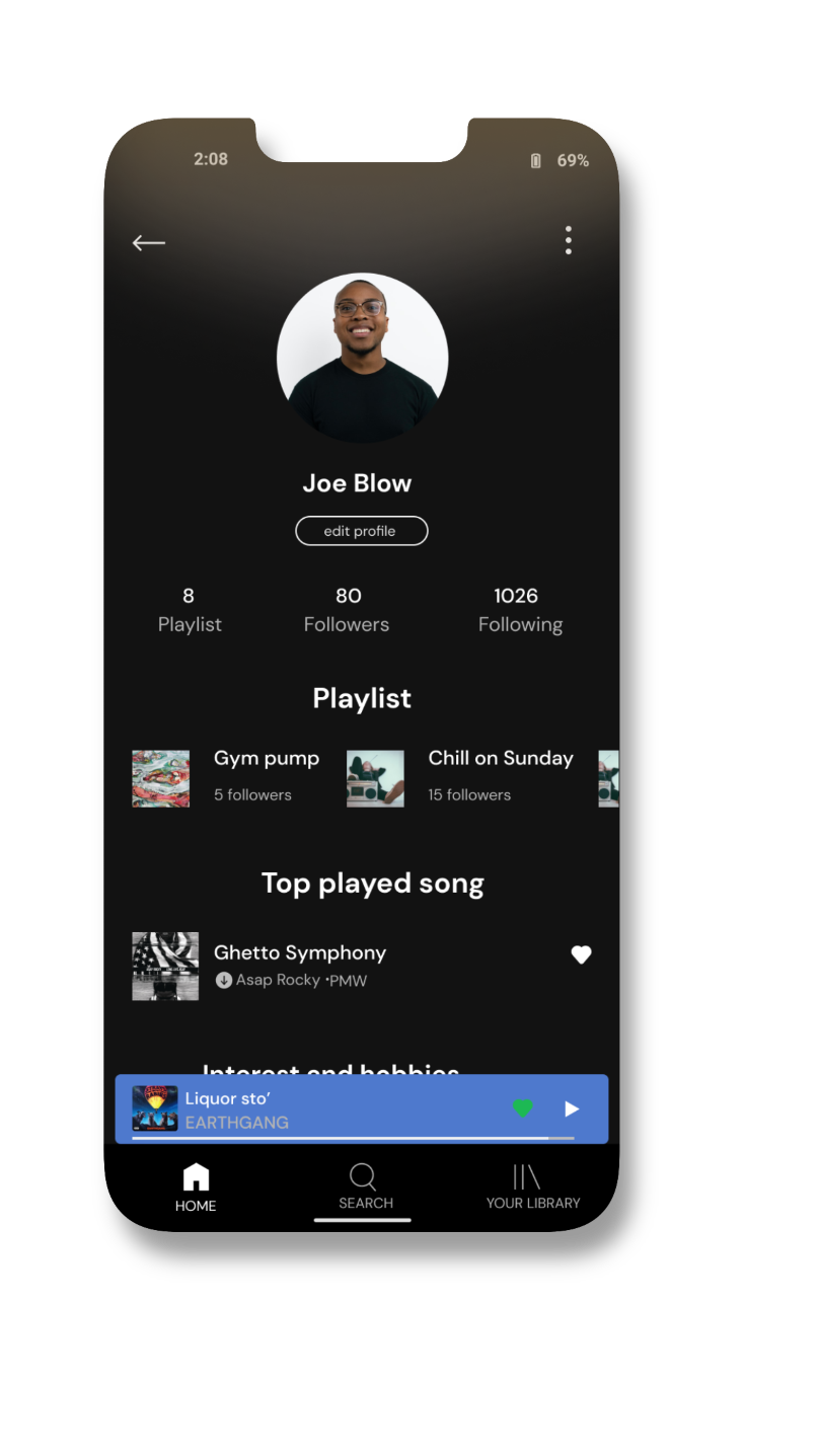

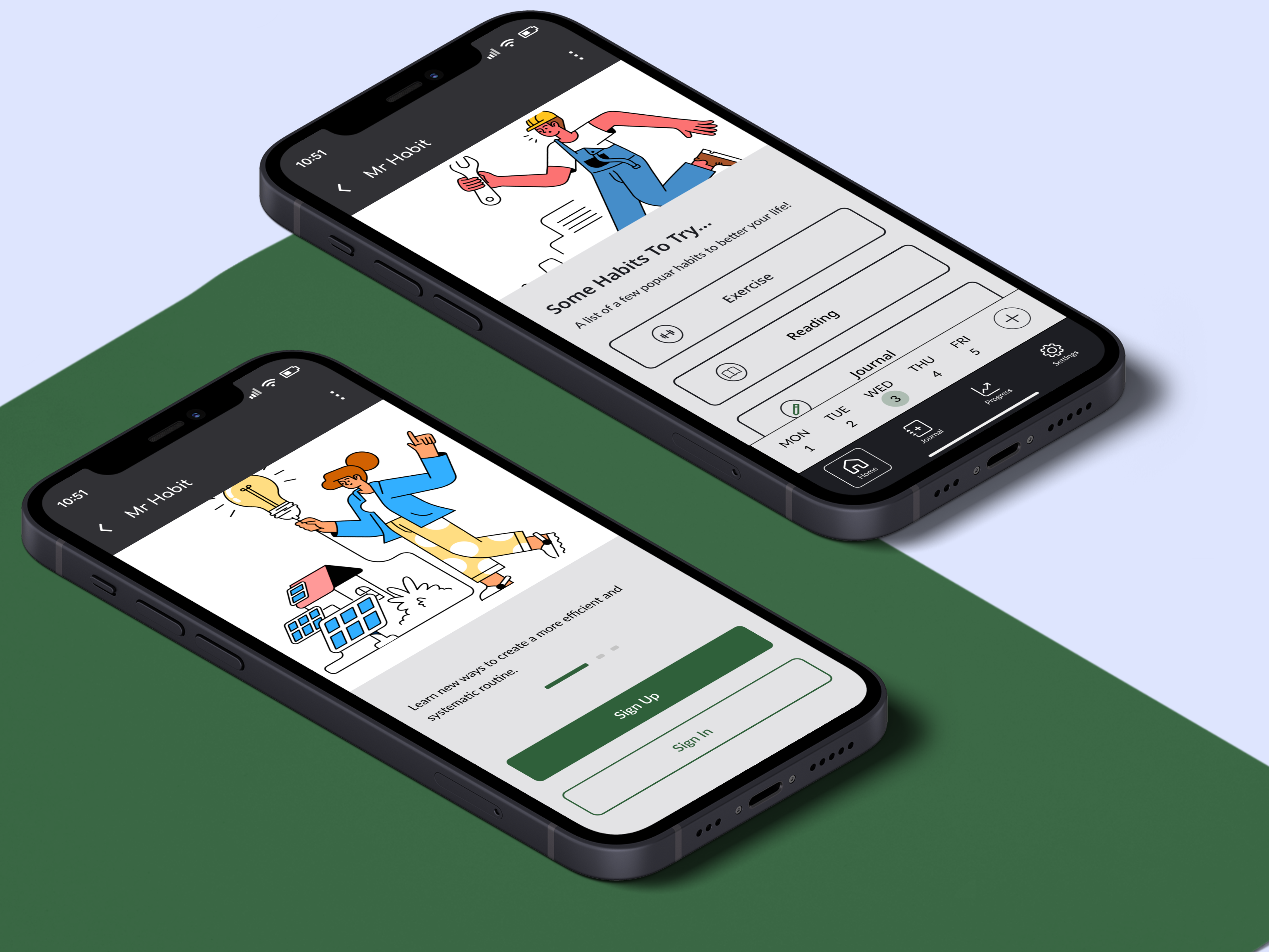
Personal Profile screen
The simple screen displays a user's personal profile. Users can edit their profile by adding their interests, hobbies, and favorite songs. Song enthusiasts can also include an eye-catching bio to give others a brief sense of who they are.
Matches screen
The matches screen displays a list of people who share similar interests. Having common interests is a great icebreaker, which can lead to sharing personal musical tastes. Building a strong rapport makes it easier to open the users' minds to trying new music.
Testing the usability on a high-fidelity prototype
The CONNECT feature underwent two rounds of usability testing. The most helpful feedback and constructive criticism, which led to an overall better and more simple design, came from peer feedback. During informal conversations (stage 1), I gathered valuable insights into what future users wanted to see, especially on the match listing screen. I discovered that the main issue was not focusing enough on the music of the matches. Peers suggested featuring more of the profile matches' favorite songs and curated playlists rather than their hobbies and interests. It was already assumed that they shared similar interests, which is why their profiles matched with each other.
First-round usability testing insights
The first step of conducting a usability test was significant. This is where I was able to obtain valuable feedback and make changes for the better. The improved iterations removed unnecessarily complex steps that would otherwise confuse and slow down task completion. One great addition that I did not take into consideration was adding some sort of background page describing the new feature. Without any announcement, users could potentially be misled and not understand what is going on, leading to design ambiguity. Some discoveries were:
Removing the curated playlist screen
Originally, the screen prompted users to curate a playlist of their favorite songs for others to see on their profile. However, this step was redundant as saved playlists were already displayed on the users’ profiles.
Add an introduction page
The first micro-frame was directly incorporated into the feature. Despite my explanation of the concept to potential users, they preferred a written breakdown of how the feature works.
The CONNECT feature’s input screen
The screen was removed from the first flow. Users (designers from Design Lab) assumed that it could be left out.
PROJECT REFLECTION
Issues & Challenges
I had no trouble finding participants who shared music, but I struggled to find people who used Spotify. Even though Spotify and Apple Music are the top music streaming services, I rarely found Spotify users. Luckily, the interviews focused on how people share music in general, not just on a specific service. Surprisingly, not a single participant used Spotify. Many were iOS users and chose Apple Music because of the affordable student discount along with ease of access.
Next steps
Like any product feature and design, there are always ways to tune or refine aspects of the design. If I had more time in the day, I would like to send out surveys. For now, I’d like to focus on:
Adding a simple flow to make it easier to find friends who have the app. Currently, Spotify only offers one option to find friends, which is to connect to Facebook. This is a problem for a variety of reasons. Some users may not use Facebook as their primary social media platform, preferring other platforms instead. By adding the ability to connect to other social media platforms and phone numbers in users' contacts, we can expand the network to find friends and discover their music preferences.
As there are time constraints, the process concludes once matching profiles are found. However, it's crucial to consider how a user can contact a matched user if they wish to do so. The next step is to implement a messaging interface that appears uniform for both Android and iOS users. This will ensure that the message to the intended profile recipient is clear and straightforward.