Curated
Stays
Project Overview
Curated Stays is designed for travelers who want an alternative to staying in a hotel. The feel and comfort of a home give users a more welcoming feel to gain the full lodging experience. With listed accommodations and personal touches to best customize a memorable trip users can get an optimal experience.
Tools
Figma
Miro
Airtable + Excel
Notion
Timeline
4 Weeks
Diving into the market
Competitive analysis, market research, and user interviews were the most effective methods for gathering user information and market information. It was crucial for Curated Stays to understand what made competing brands successful in retaining users and to uncover user motivations. This insight helped prioritize features and structure the content layout.
The interview findings
1. The rental pricing comparison feature allows users to compare rental stay options for the best value.
2. Easy, intuitive interactions and images to showrooms and area spaces (with titles of what image is being shown). Displaying the names of areas lets users better understand the layout.
3. A precise, concise date picker needs to be quickly and readily accessible; users often change dates when booking a vacation.
4. Participants want an easy way to identify the message inbox with notifications; users can quickly check and respond to messages to better prepare for their stay.
Functionality comes first
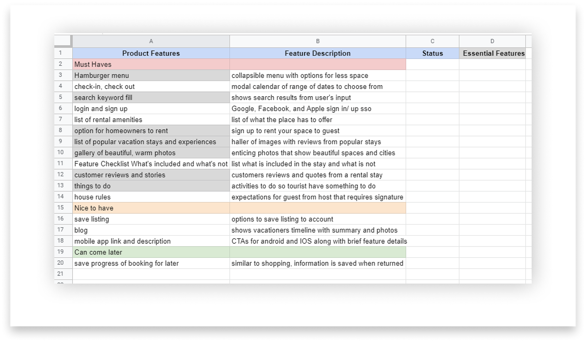
During the research phase, I compiled a list of features from most important to least important. Not all features were included in the design; only the essential ones were included for prototyping and user flow. One exciting discovery was the potential for a romance feature for couples who want a more intimate getaway. Since most participants traveled with their significant others, offering a more personalized experience to enhance their travel could help them make the most of their trip.
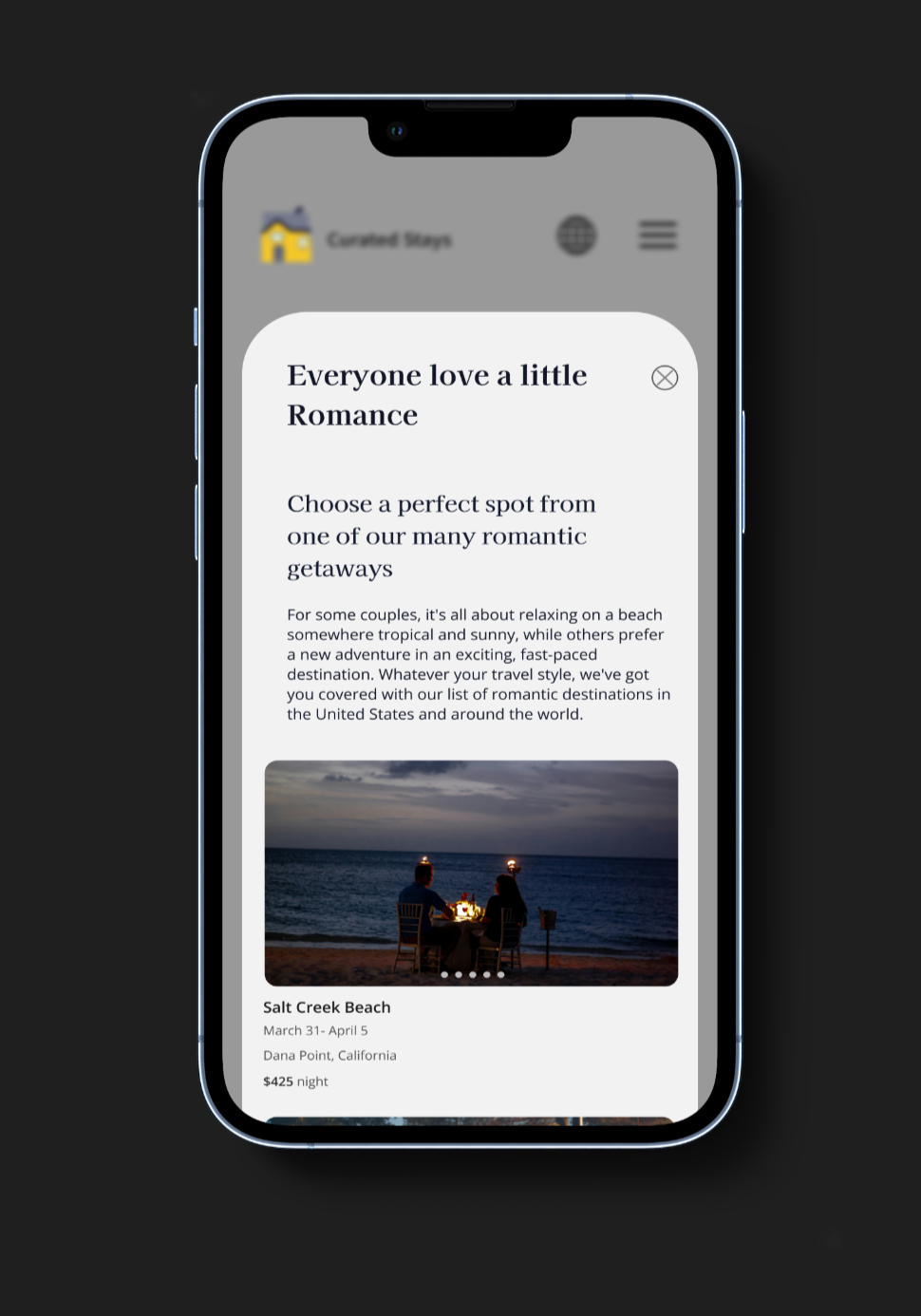
Romance in the air
The romance feature, located in the 'things to do' modal, is not part of the user flow but is shown in the final design. Participants fondly reminisce, sharing their fun experiences. In addition, I had not seen any similar feature in any of the famous peer-to-peer lodging sites. A simple yet promising feature will separate Curated Stays from the pack. As I continuously revise the design and make a more complete interface, the next step would be to create a separate user flow, focusing solely on booking a romantic trip.
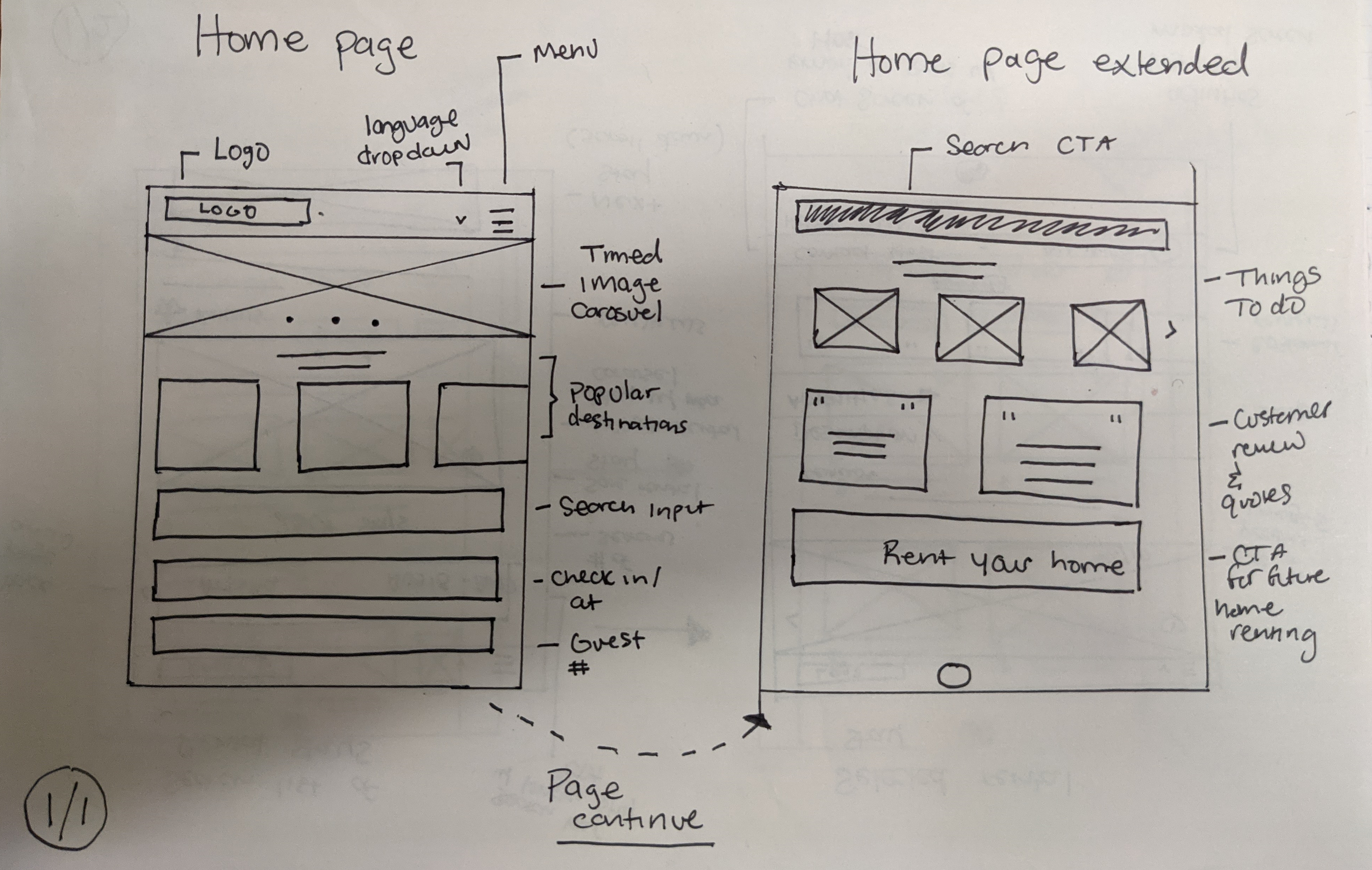
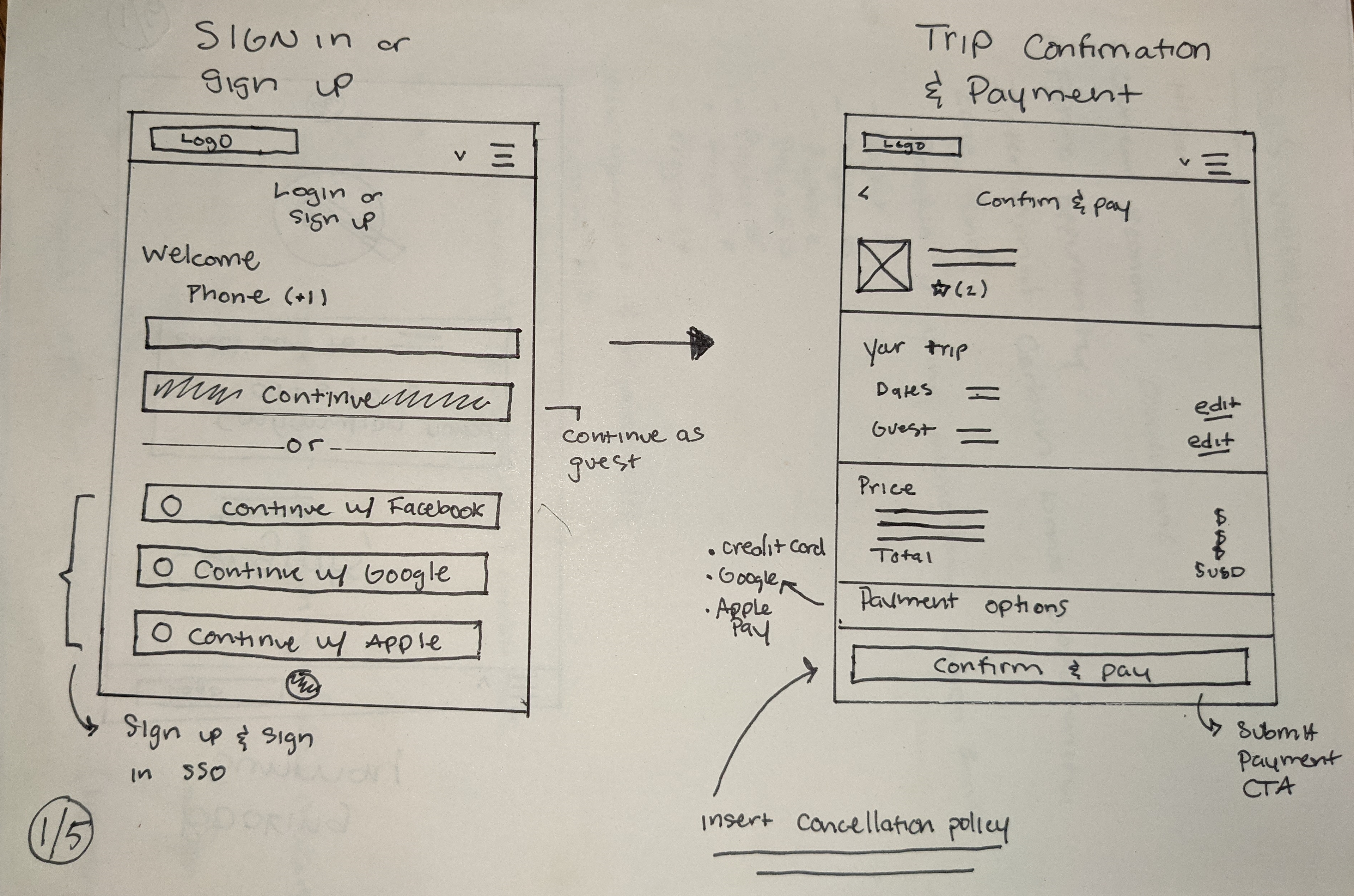
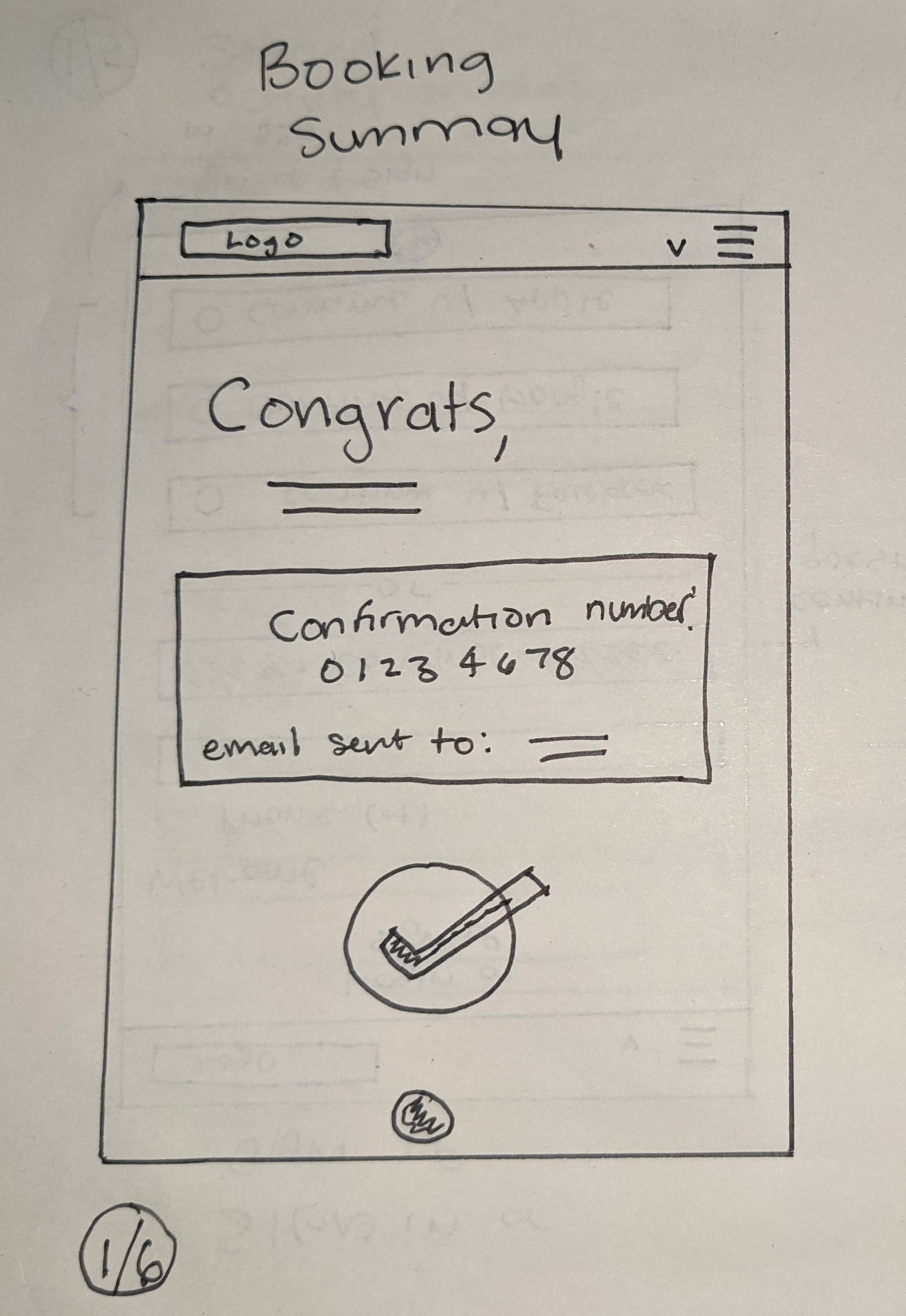
Sketching the user flow
I created sketches that serve as low-fidelity wireframes, concentrating on content layout. I deliberately included only essential information during this iterative process, prioritizing the mobile user experience by adopting a mobile-first approach. The labeled elements indicate the displayed content and its order, showcasing hierarchy and importance. Additionally, I carefully considered spacing and alignment.
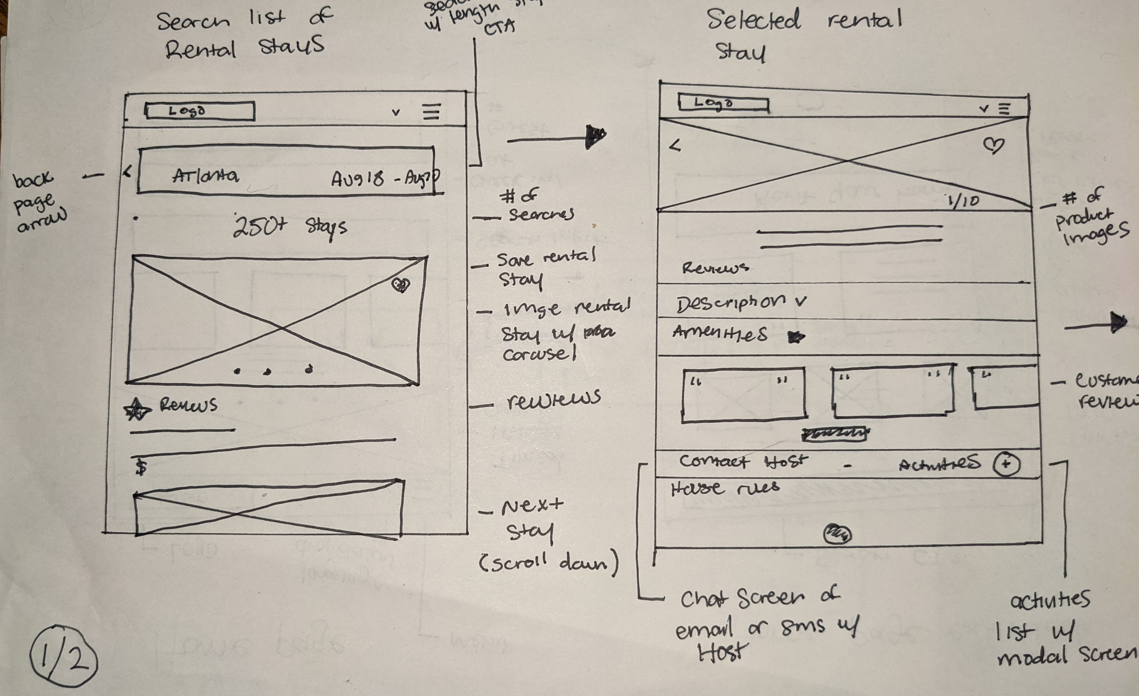

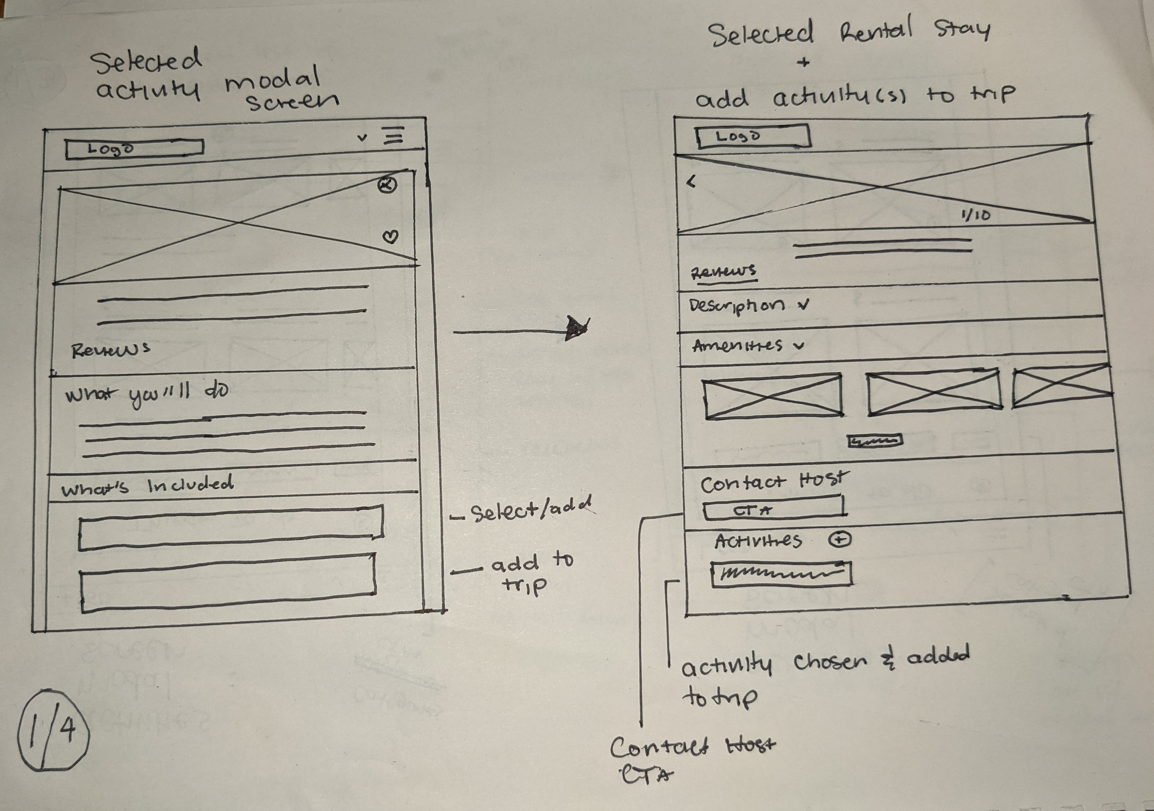
Micro frames
Combining the user flow and wireframe saved time and made the process more efficient. It also streamlined the prototyping process. Conducting two rounds of usability testing made it easier for participants to test the content structure. Removing the visuals helped users focus solely on the information necessary to complete the task.
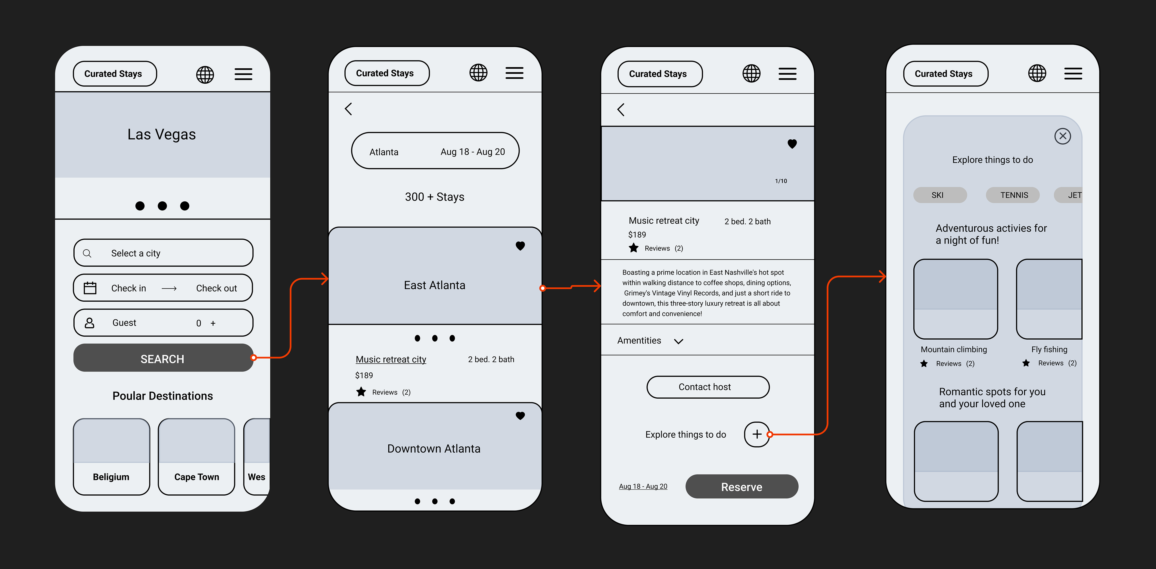
User flow
Micro frames are great, but adding a user flow visual makes it easier to identify the goal that needs to be accomplished.

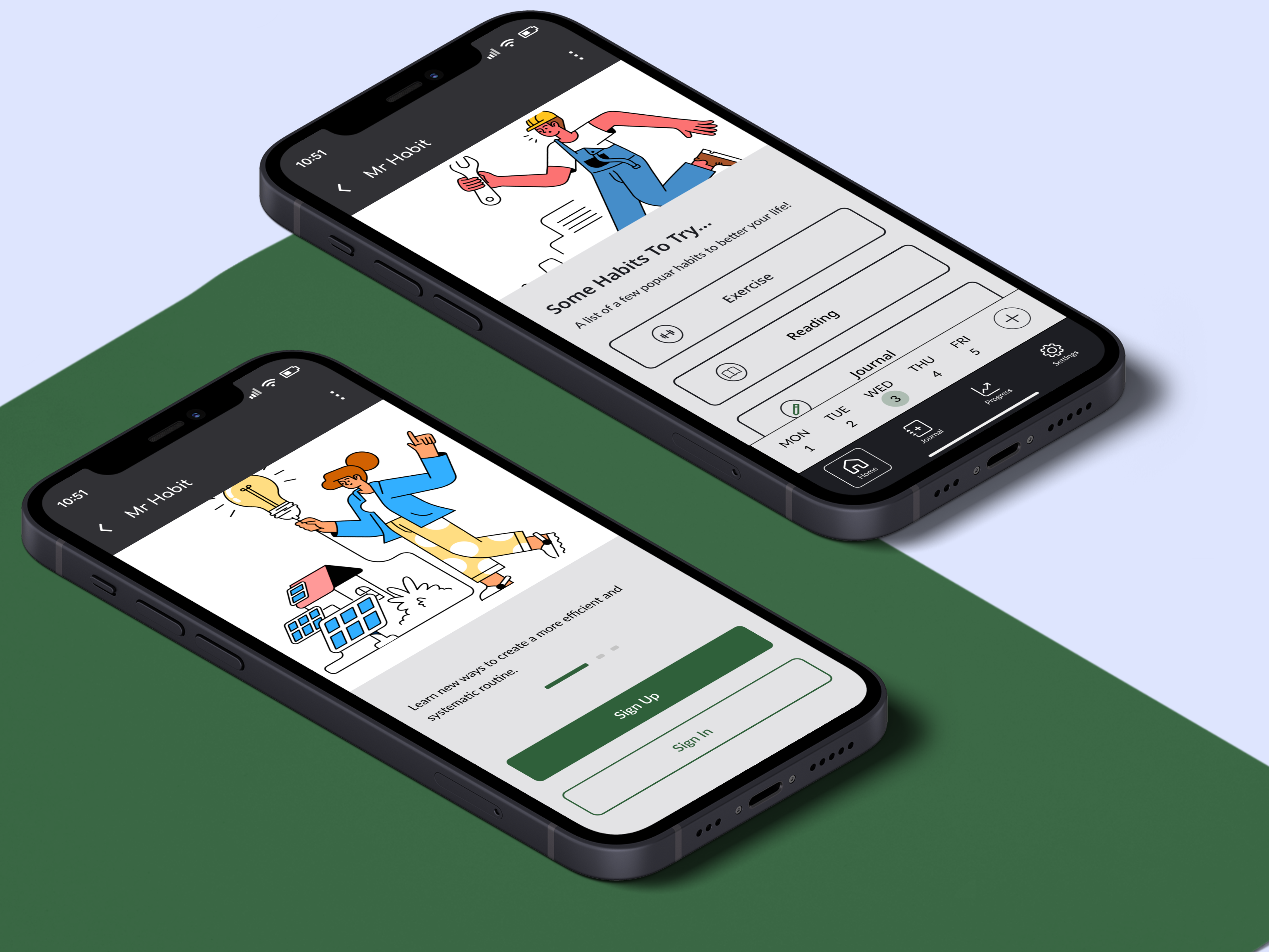
Ideate & prototype
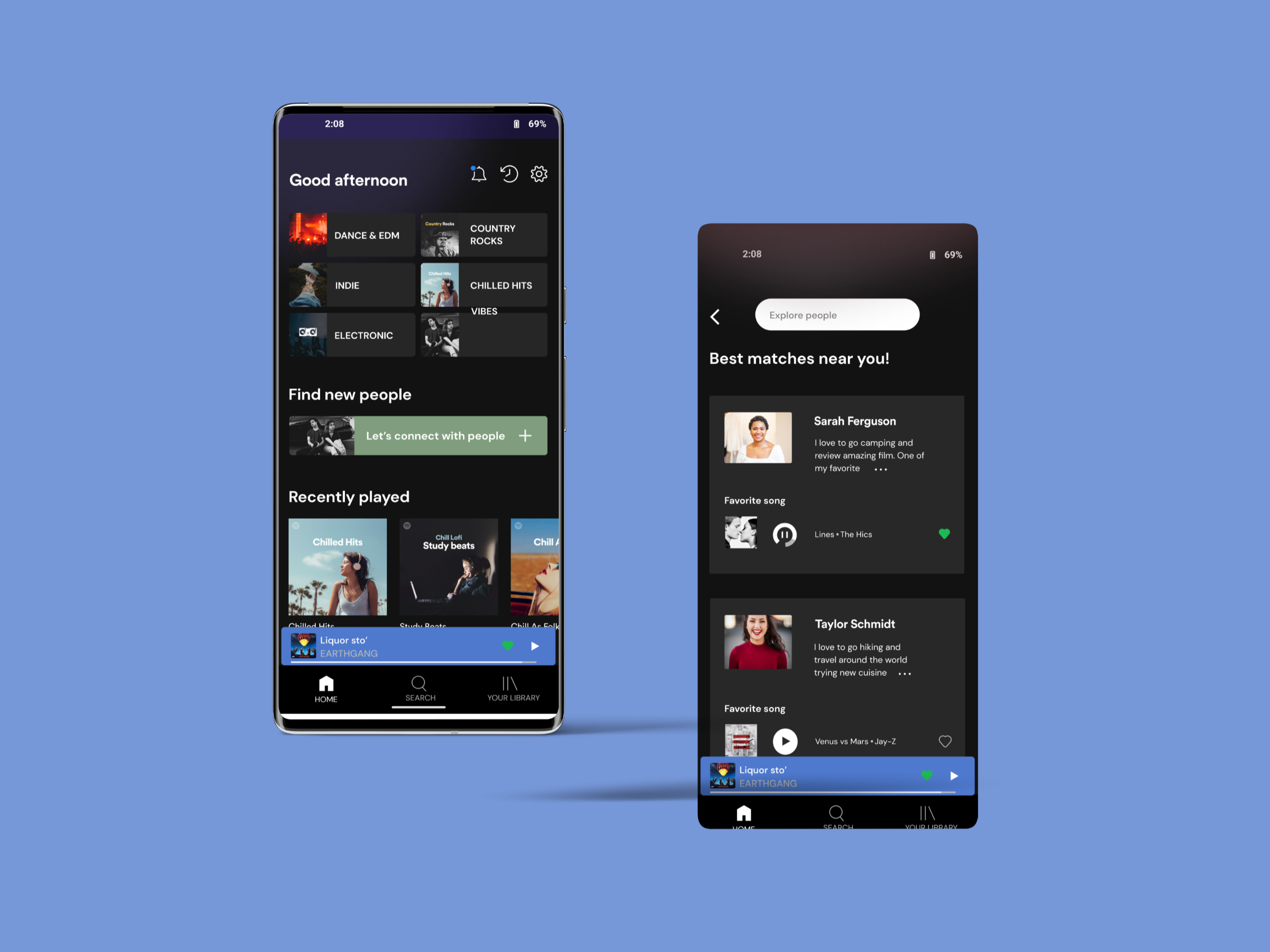
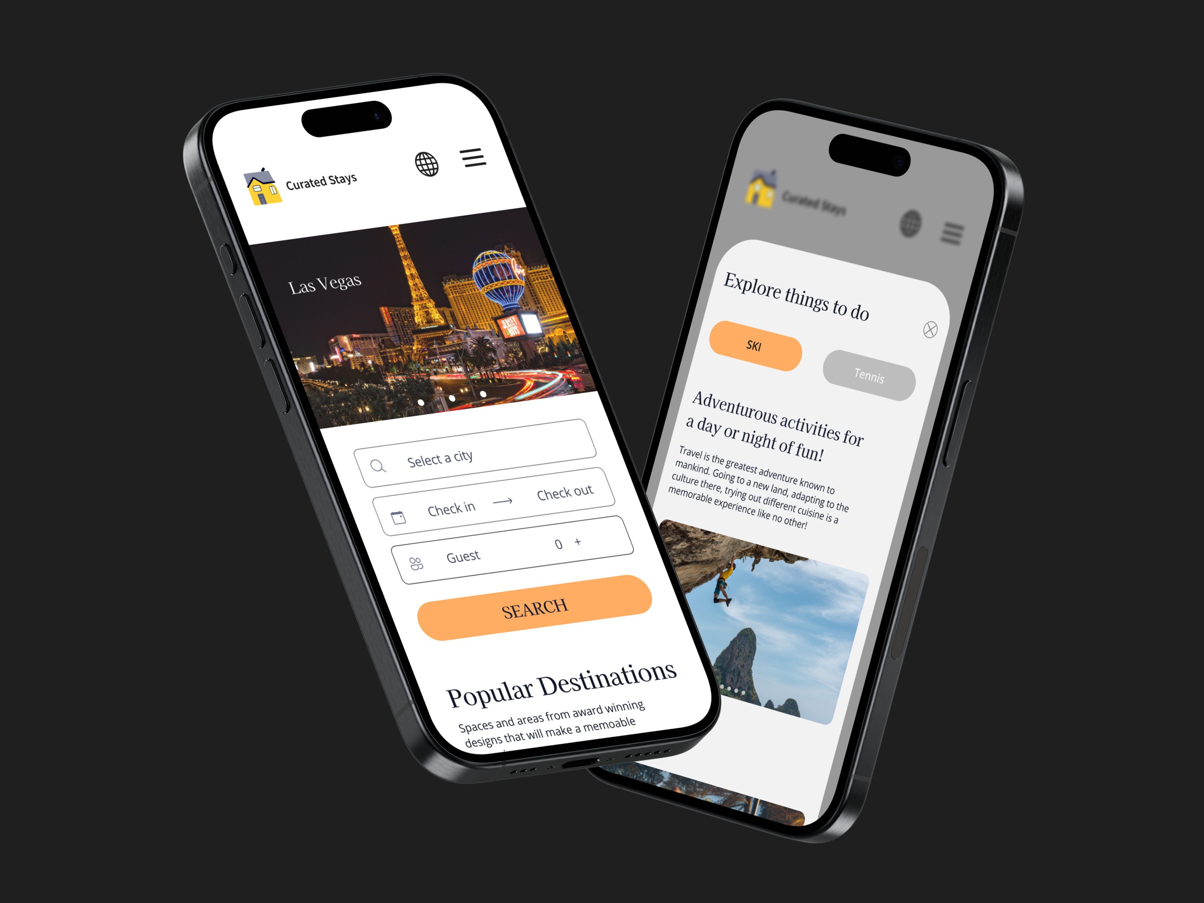
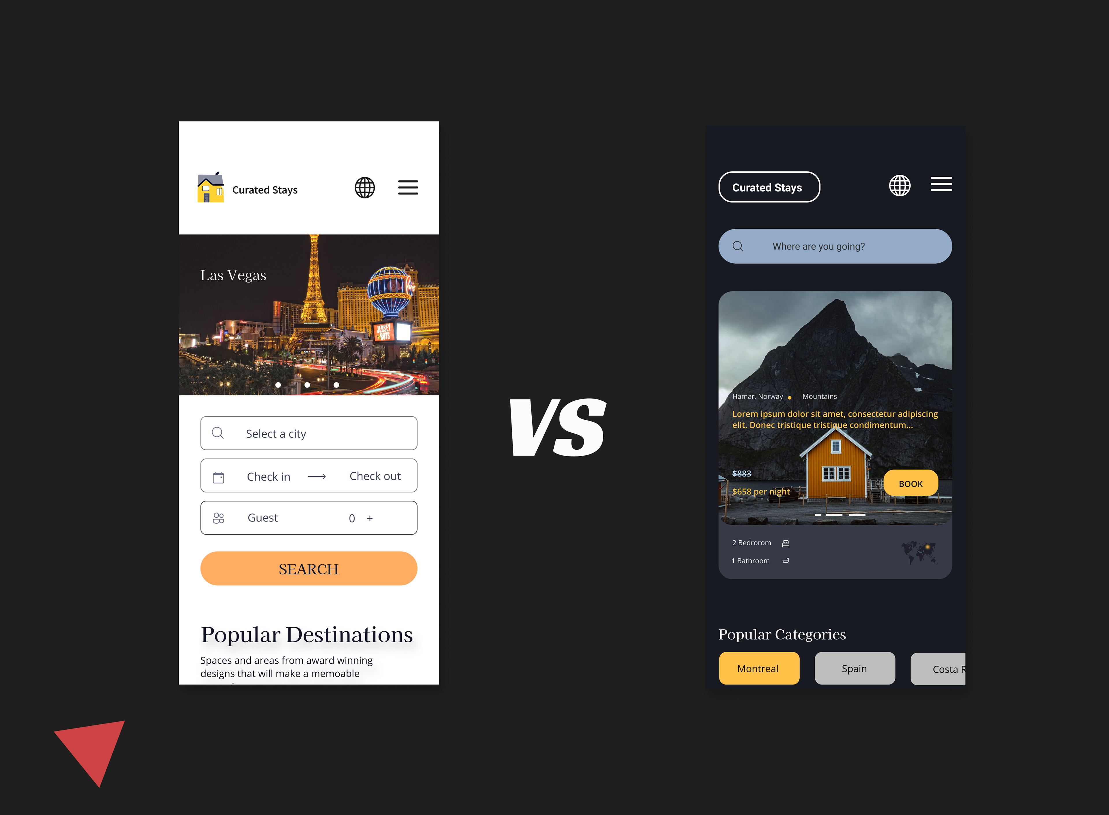
After creating the best and most optimal layout, it was time to infuse the design with creativity and passion. Drawing inspiration from Dribbble and similar peer-to-peer websites, I finalized the UI design. I designed five screens and chose the option that made it easy to distinguish and recognize text, color, imagery, and CTAs.
I initially wanted a light theme to create a clean yet exciting interface. The plan was to avoid overwhelming the users with too many colors. The booking experience can be overwhelming and stressful as it's a process that takes time. The selected dark theme works well because the yellow, which wasn't too saturated, evoked happiness and demanded attention. The dark, navy-like background made the text and colors stand out, but I chose the light theme. It was more appropriate and suited for a travel booking app. Competing apps also had a light theme, and considering that a light theme presents better visual performance for ther assignment.
Choosing a date
During the research phase, it was clear that there was a recurring need for the ability to easily and quickly change trip dates. Often, the dates are not firmly set when coordinating with fellow travelers. Users need to coordinate their schedules and make adjustments. The date call-to-action (CTA) is visible as users scroll through content. The date picker interface design displays the selected vacation dates, and users can also clear the date range with a single action rather than multiple taps.

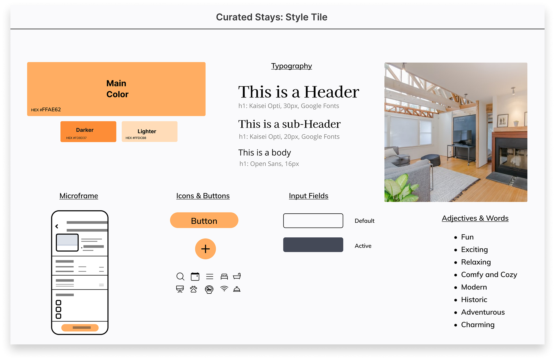
Style Tile
There was no need for an elaborate design system or even a style guide. I chose something more simple and suitable for Curated Stays due to time constraints, project simplicity, and being the solo designer for the project. The elements that make up this deliverable are visuals that will be used heavily throughout the design.
Prototyping & testing
I conducted two rounds of usability testing to better understand the interface's issues. With a strong foundation, improvements can be implemented swiftly. The participants in the testing helped identify which elements or variations worked best so that I could make the necessary changes. The first round of testing was done using micro frames, which focused on identifying any flaws and gaps in the logic.
During the second round of testing, I used the final product. Unfortunately, I couldn't use my preferred precise analytical tool, Maze, which collects actionable insights to create a better user experience. One change we made after considering which content should be visible was extending the length of the page. Users felt they had more control and options, so they took advantage and explored more.
Insights and Issues
1. The absence of the Maze tool meant I had to discover how users interacted with the interface visually. Lacking experience in usability testing may have hindered the revision process
2. Testing on my mobile device meant that I had to take notes, and in that case, I missed many subtle details
3. A share and download option on the confirmation page was added so users could share trip details with those they were traveling with
4. The globe located in the header was confusing; users continued to ask what was its purpose
Affinity map

PROJECT REFLECTION
What’s next
The first step is to add more content and features so that users can test the closest thing to a finished product. Introducing the romance feature as another user flow within the design will enhance its overall design and capabilities. To achieve this, another round of interviews and testing will be necessary to determine if this feature is as highly requested as I assume. Additionally, I will search through competing brands' app reviews and online forums to identify highly requested features.
1. Polish more on the UI Design and enhance the prototyping interaction
2. Visit with a developer and discuss handoff requirements
Project takeaways
Finding participants who had not only traveled but used a peer-to-peer marketplace site rather than a hotel was challenging. I had to widen my criteria. Participants had excellent responses, but reflecting on their experience would have provided more clarity if it had been more recent.
1. Organization and documentation are crucial aspects of the UX process. It is essential to take notes and track ideas and concepts. One issue I encountered was forgetting specific thoughts that could improve the project's direction and outcome. Moving forward, I plan to use Notion to record important outcomes and ideas as they come to mind.
2. I need to improve my research skills and build a stronger project foundation. I plan to contact a UX Researcher to pick their brain or watch more interviews. Instead of gaining clarity during the interview, I replayed the audio and tried to make sense of the participant's responses.